Coopcerto App
App Redesign
Data analysis
Analytics tagging
Research
A full redesign of a regulated financial product, focused on scalability, usability, and measurable impact.
2024
Year
1 year
Duration
Bank
Field
Figma
Tools

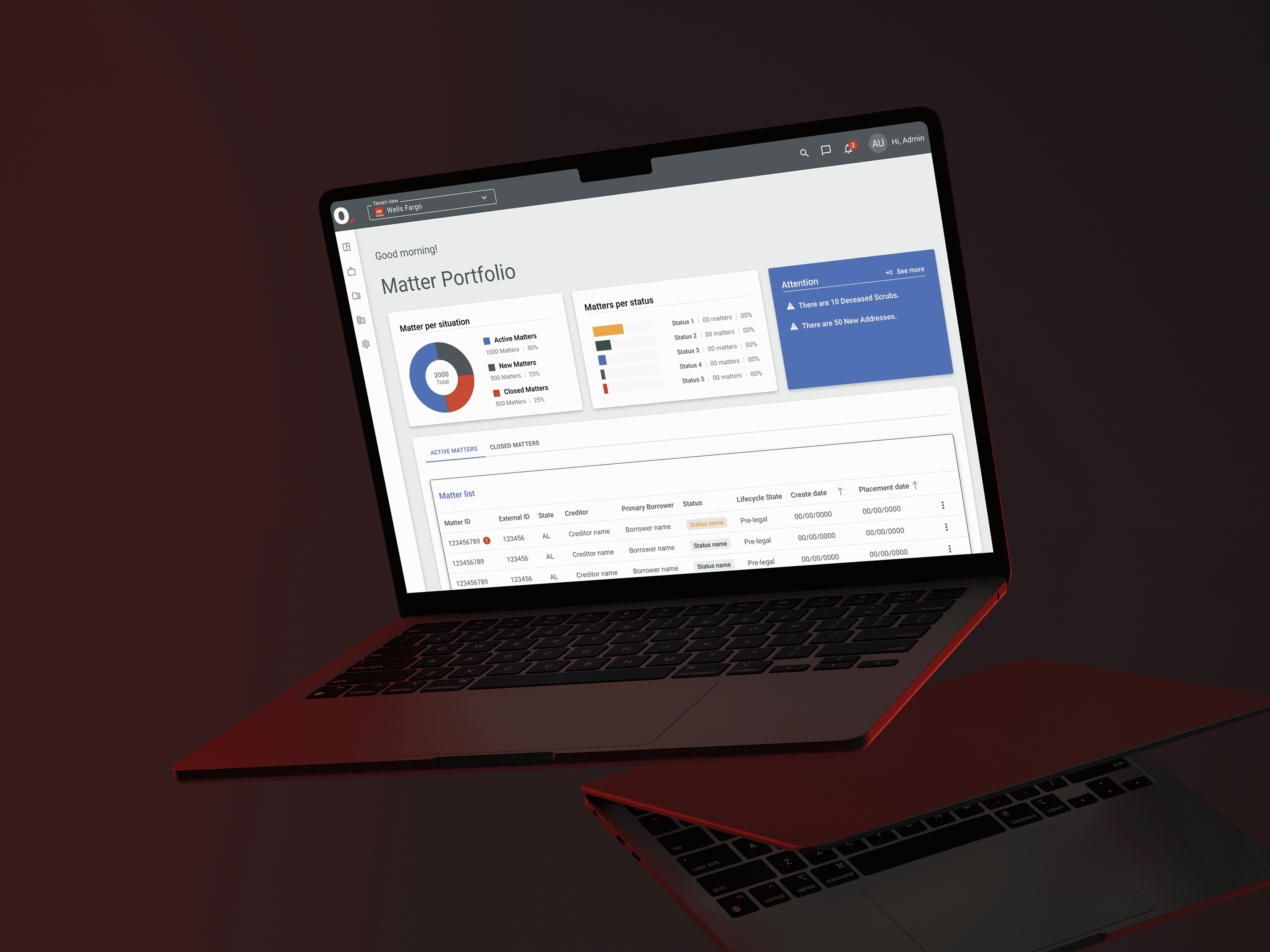
Project Details
Main Goal
Redesign and rebuild a legacy benefits card app into a scalable, compliant, and user-centered product, improving usability and user satisfaction in a regulated financial environment.
Challenges
-Strict regulatory and audit requirements -Legacy screens completely outside any design standard -No prior componentization — required aligning tokens, JSON structures, and components -A design system still evolving, with frequent theme swaps -Despite these constraints, the team delivered consistently without major rework.
Deliverables
-Sole designer leading end-to-end redesign of a B2B2C fintech app -Rebuilt the product from legacy, non-scalable UI to a standardized system -Introduced key features expected in modern benefits apps -App rating increased from ~2.8 → 4.5+ -Strong growth in 5★ reviews and reduction in negative feedback
Context
Coopcerto is a prepaid benefits card used by companies to offer employee benefits.
The product operates in a highly regulated financial environment and serves both business clients and end users.
When I joined, the app available in the stores:
Was visually outdated
Had inconsistent UX patterns
Was not componentized
Had low user ratings and frequent complaints
At the same time, the product was preparing for:
The introduction of a new card network
Design system updates
Ongoing audits and regulatory reviews
Problem
From both user feedback and internal analysis, the main issues were:
Low app store rating (~2.8)
Fragmented experience and confusing flows
High number of usability-related support tickets
Missing core features (location, clearer statements, notifications)
No scalable design foundation for future growth
My Role
I was the only Product Designer on the project, working with a cross-functional squad:
2 Front-end Engineers
2 Back-end Engineers
1 QA
1 Product Owner
I owned the process end to end:
Discovery and analysis
UX and UI design
Prototyping and validation
Stakeholder alignment
Analytics tagging (Firebase)
Design handoff and documentation
Process
Discovery & Research
Because of regulatory constraints, discovery relied heavily on:
Reviewing extensive internal documentation
Understanding compliance and audit requirements
Stakeholder interviews across teams
In parallel, I conducted a deep competitive benchmark of benefits card apps to identify:
Industry UX patterns
Security and authentication standards
Best practices for card management and statements
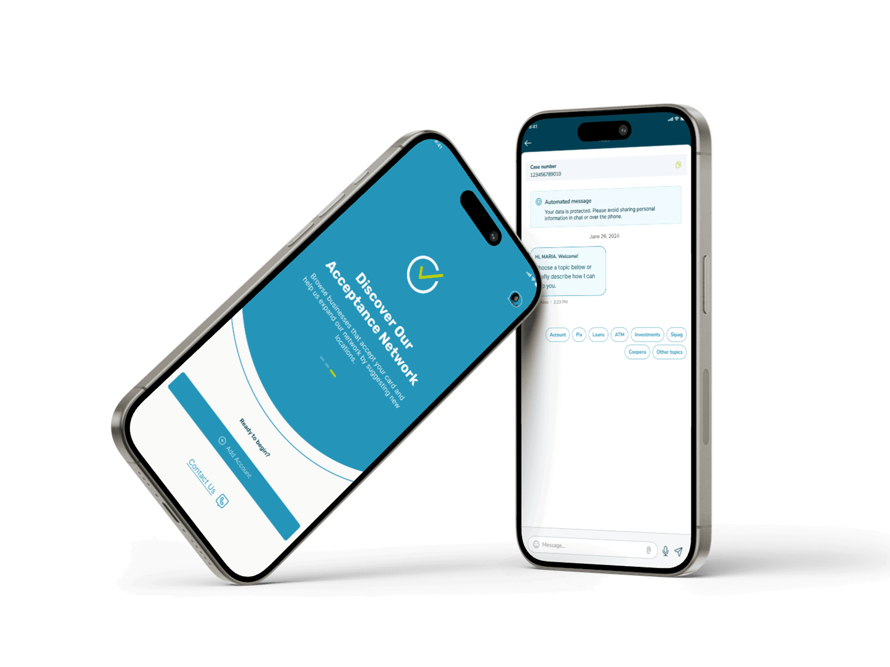
Location-based discovery features
I also participated in the early stages of research related to the onboarding of a new card network.
Collaboration & Validation
Frequent design reviews with stakeholders
Close daily collaboration with engineering
Multiple internal feedback loops
Usability testing after high-fidelity delivery
Solution
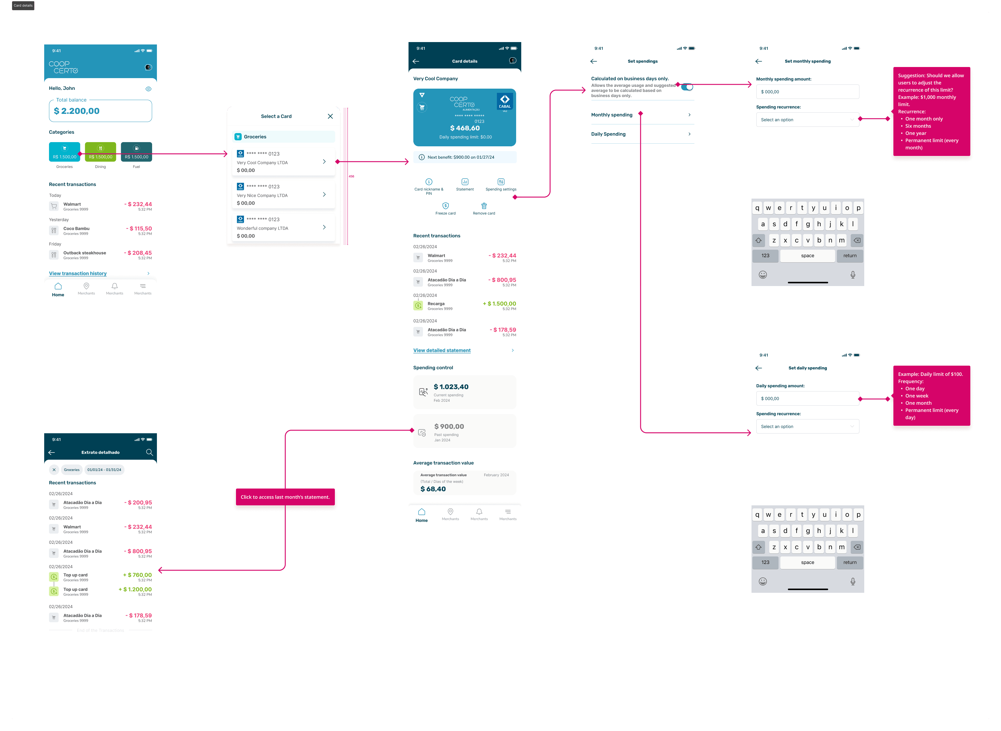
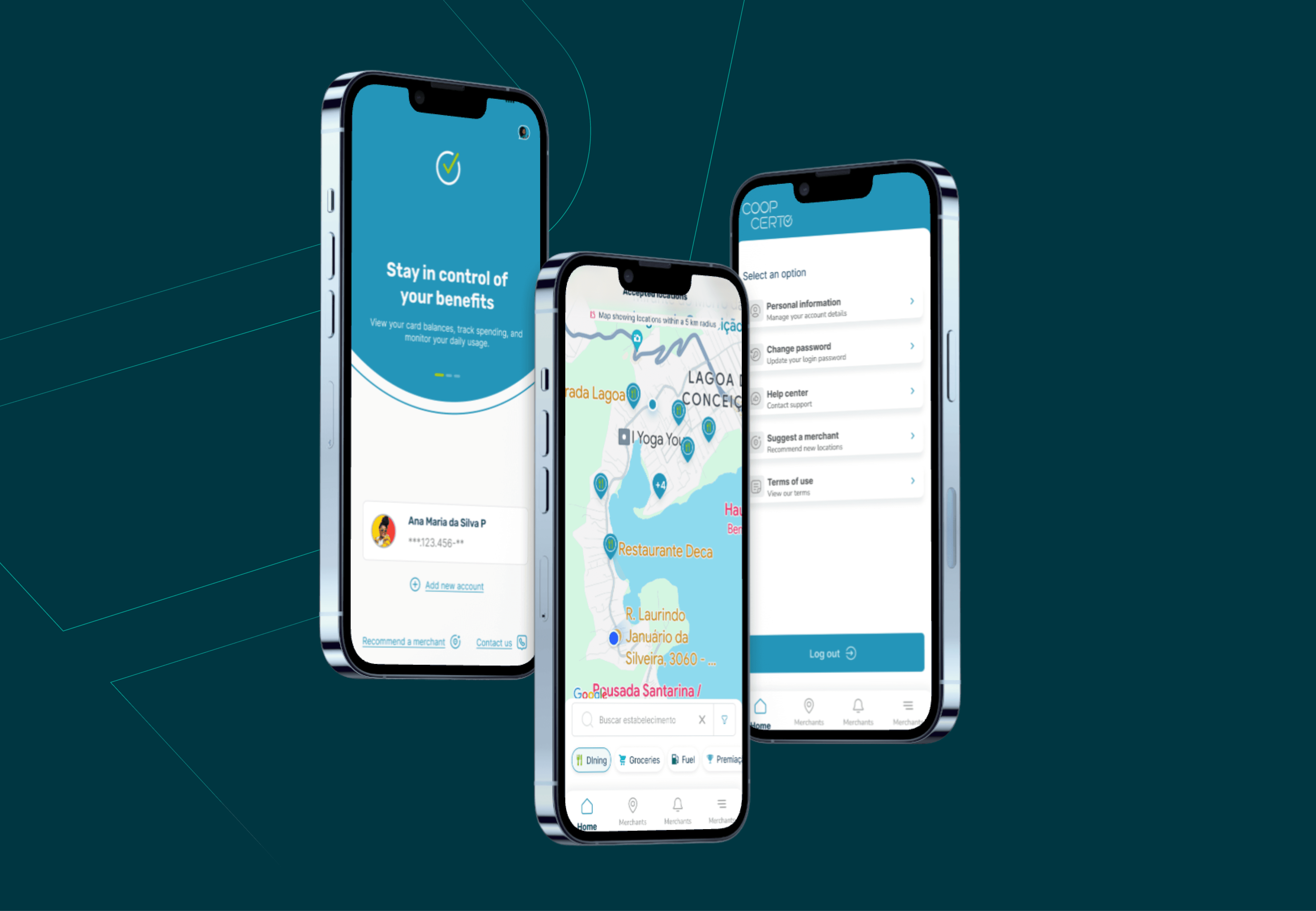
Full redesign using Coopcerto’s Design System (Acland)
Scalable and standardized flows and components
Navigable high-fidelity prototype
Analytics events mapped for Firebase
Updated institutional website
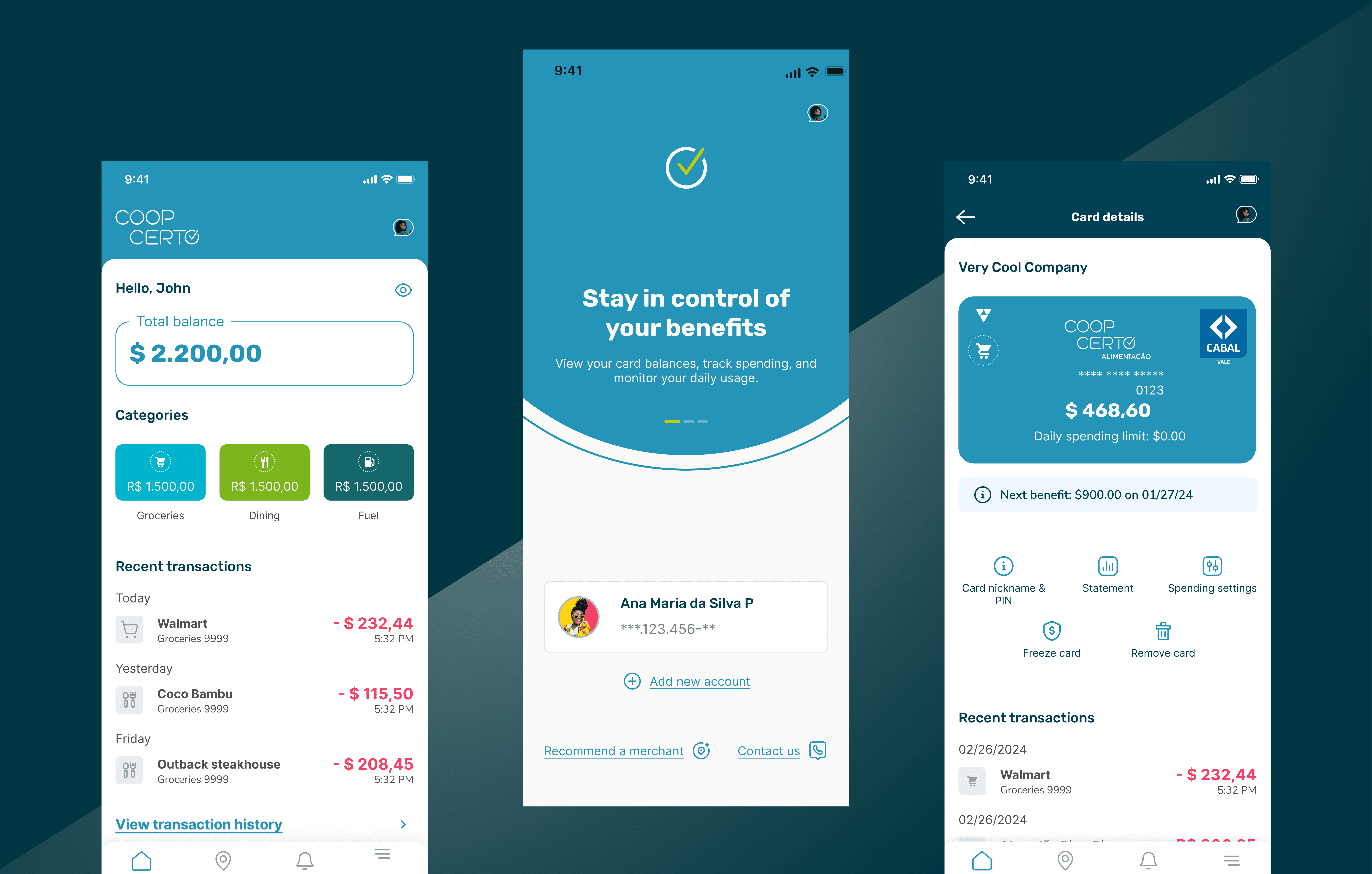
Key features
Nearby establishments map with filters
Redesigned authentication flow
Card details, statements, and transaction history
Balance and payment issue notifications
Integration of Sicoob’s virtual assistant
Results & Impact
Due to the B2B2C nature of the product, traditional conversion metrics were not the primary success signal.
Instead, user perception and feedback were the strongest indicators:
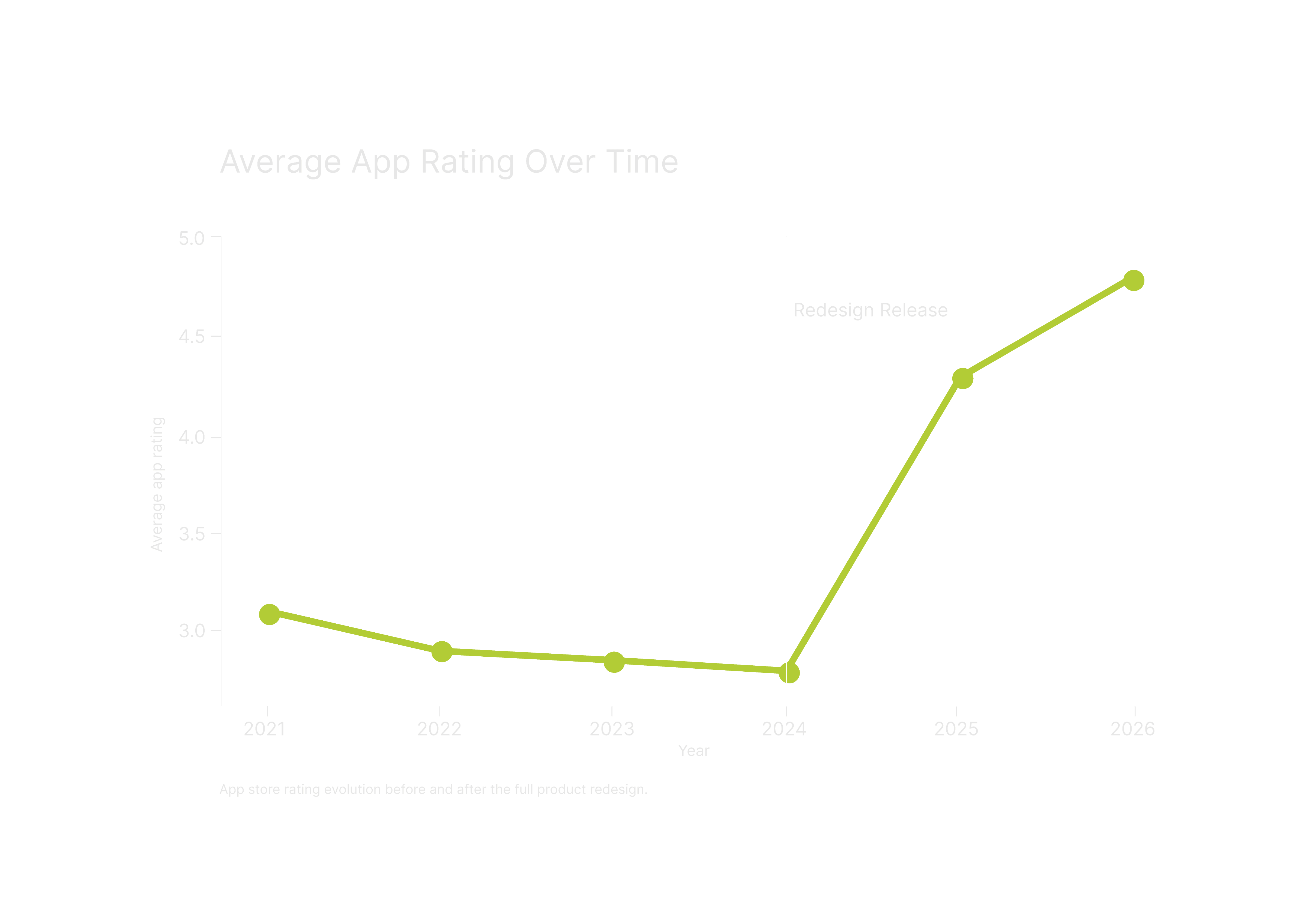
App rating increased from ~2.8 to 4.5+
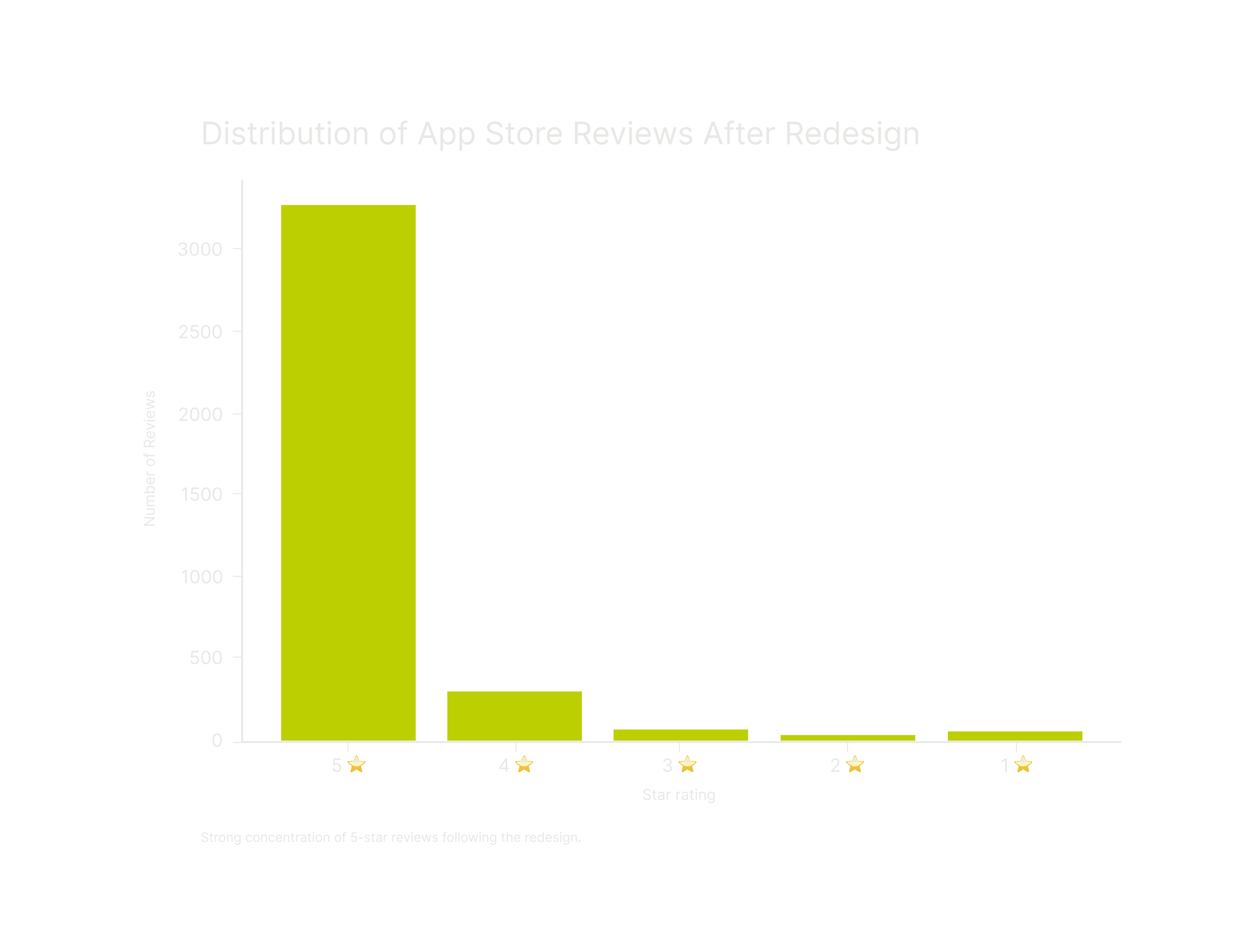
Large increase in total reviews, with a strong concentration of 5★ ratings
Clear drop in negative reviews and complaints
Reduction in usability-related support tickets
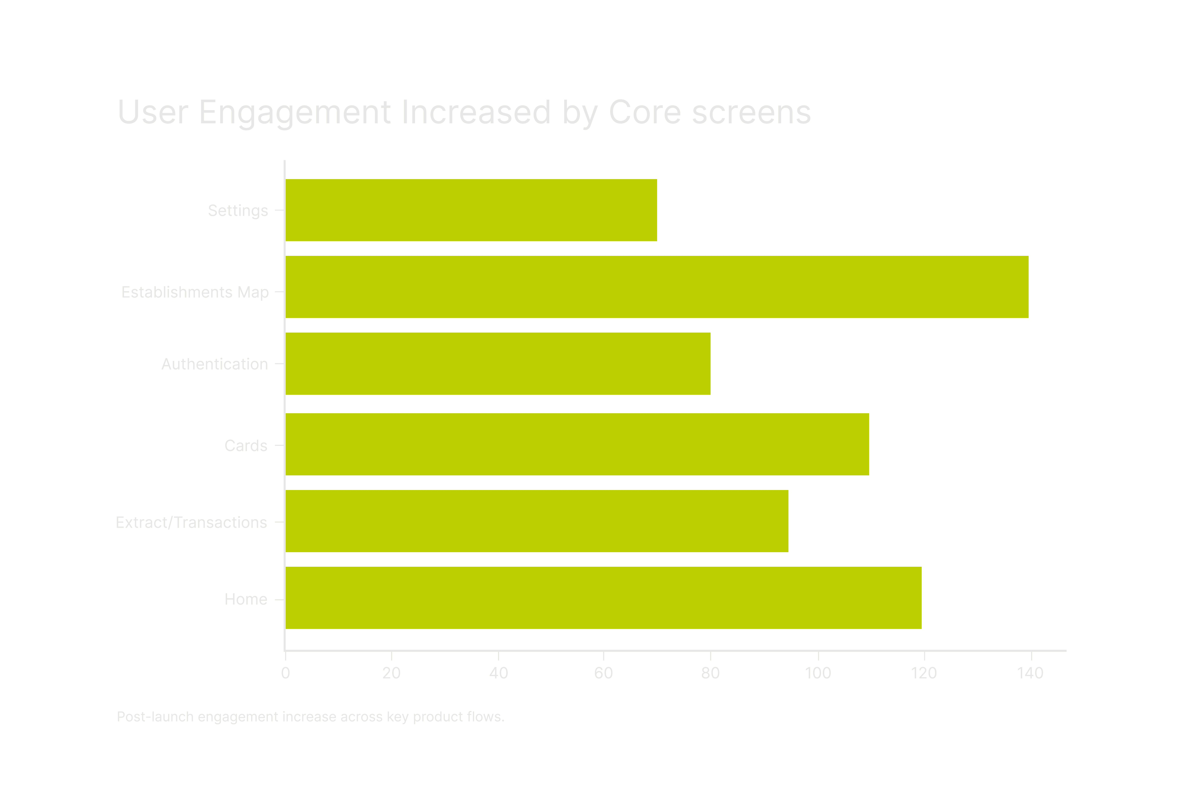
Improved task completion across core flows
These results reflect a significant improvement in usability, trust, and perceived product quality.
Results
Learnings
- Designing financial products requires deep domain understanding - Scalability matters even more in regulated environments - Strong documentation reduces long-term product and engineering friction - User satisfaction is often the clearest signal of UX success
App rating increased from 2.8 to 4.5
Strong growth in 5★ reviews
Reduction in negative feedback and support tickets
Improved task completion across core flows
Cool Data
Highlight in numbers:
🤘🏻 Team of 7
⏳ 1 year
🛠️ 13 Flows
💎 +1.7-point increase in app rating (2.8 → 4.5)